Role: UI\UX Digital Designer
PROBLEM
Optimizing Landing Page for user engagement and increasing event registrations
Product: Virtual Event Landing Page Redesign
The goal of this project was to redesign a landing page for a virtual event, optimizing it for user engagement and increasing event registrations. The existing design was functional but required improvements in user flow, information presentation, and overall user experience to ensure better conversion rates and higher event participation.
KEY FINDINGS & SOLUTION
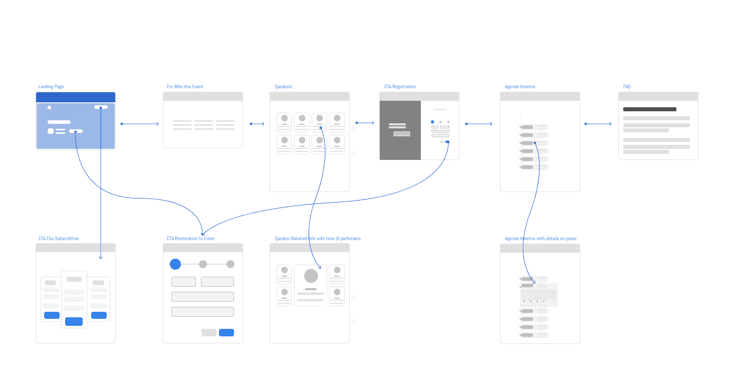
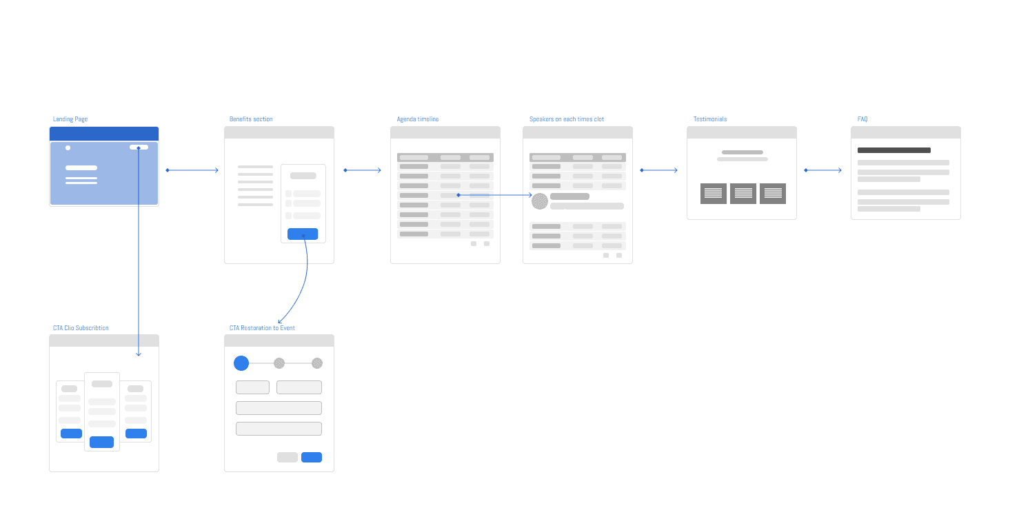
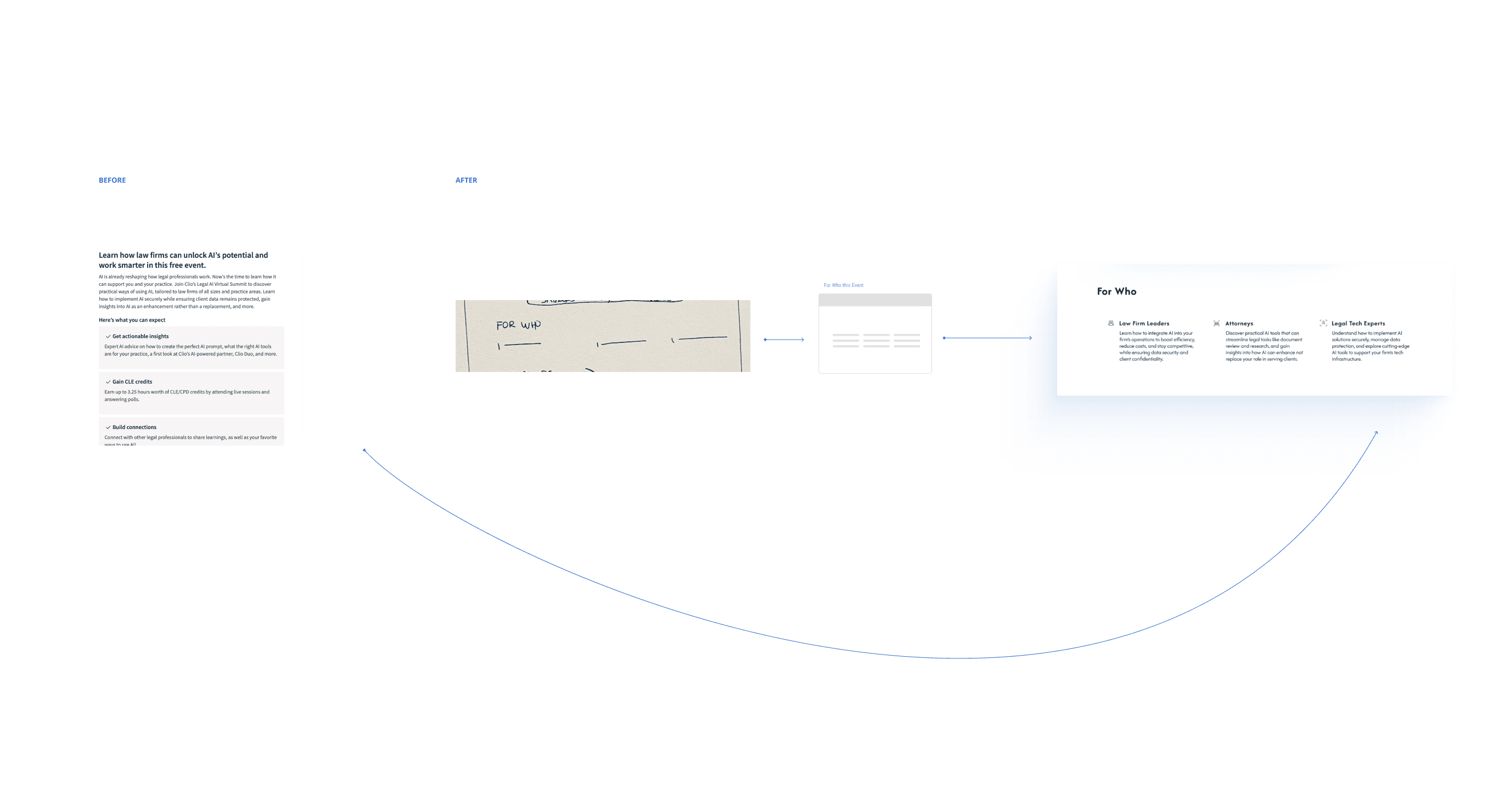
Registration Process - Wireframe
DISCOVERY PHASE: OBJECTIVES & METHODS
Identify pain points in the current design and refine the user journey to enhance interaction and registration.
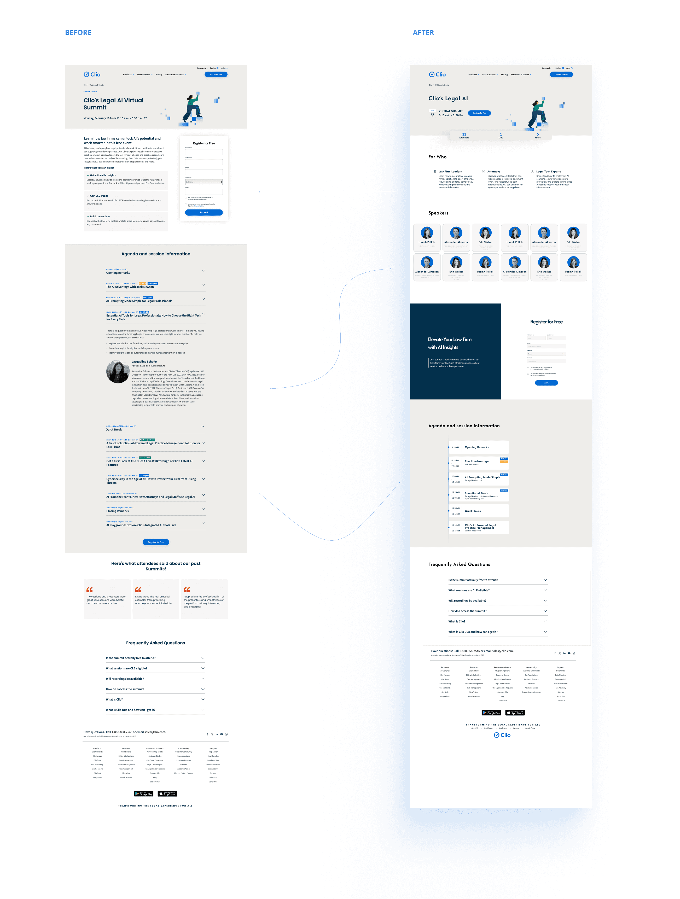
The primary objective was to identify pain points in the current design and refine the user journey to enhance interaction and registration. Key methods included user flow and wireframing. Challenge was to address moments of indecision when users land on the site. Goal is to keep them engaged during these critical moments and guide them toward registering for the event.
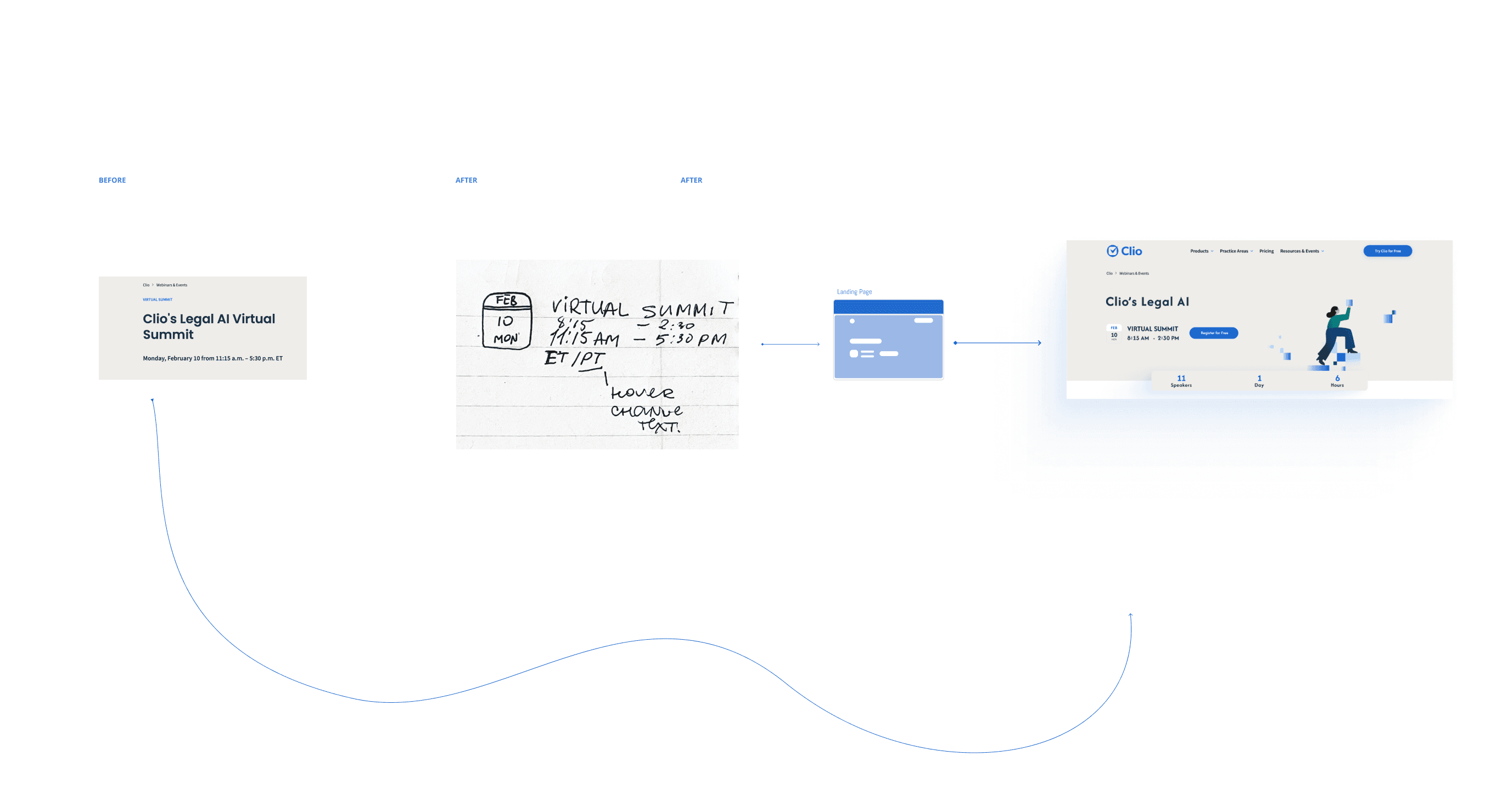
The registration button was not immediately visible, making the call-to-action less intuitive and causing potential users to miss the opportunity to sign up. Solution: I added an additional CTA button near the top of the page, ensuring users could easily find the registration option without having to scroll. Aswell as improved UI of Registration form.
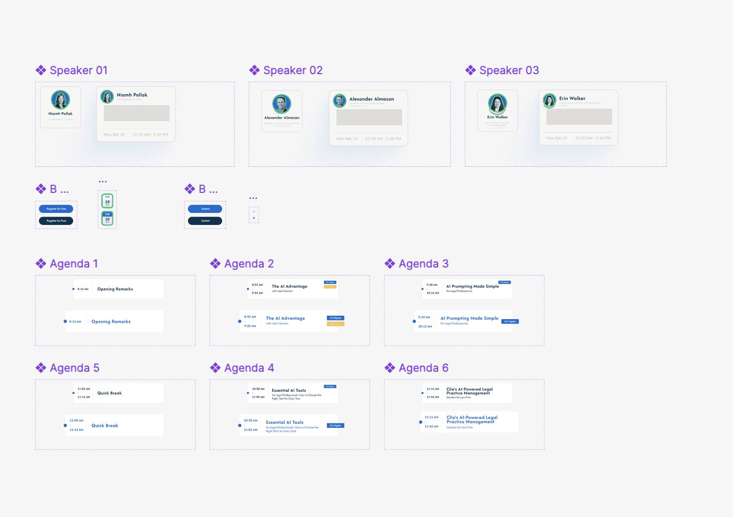
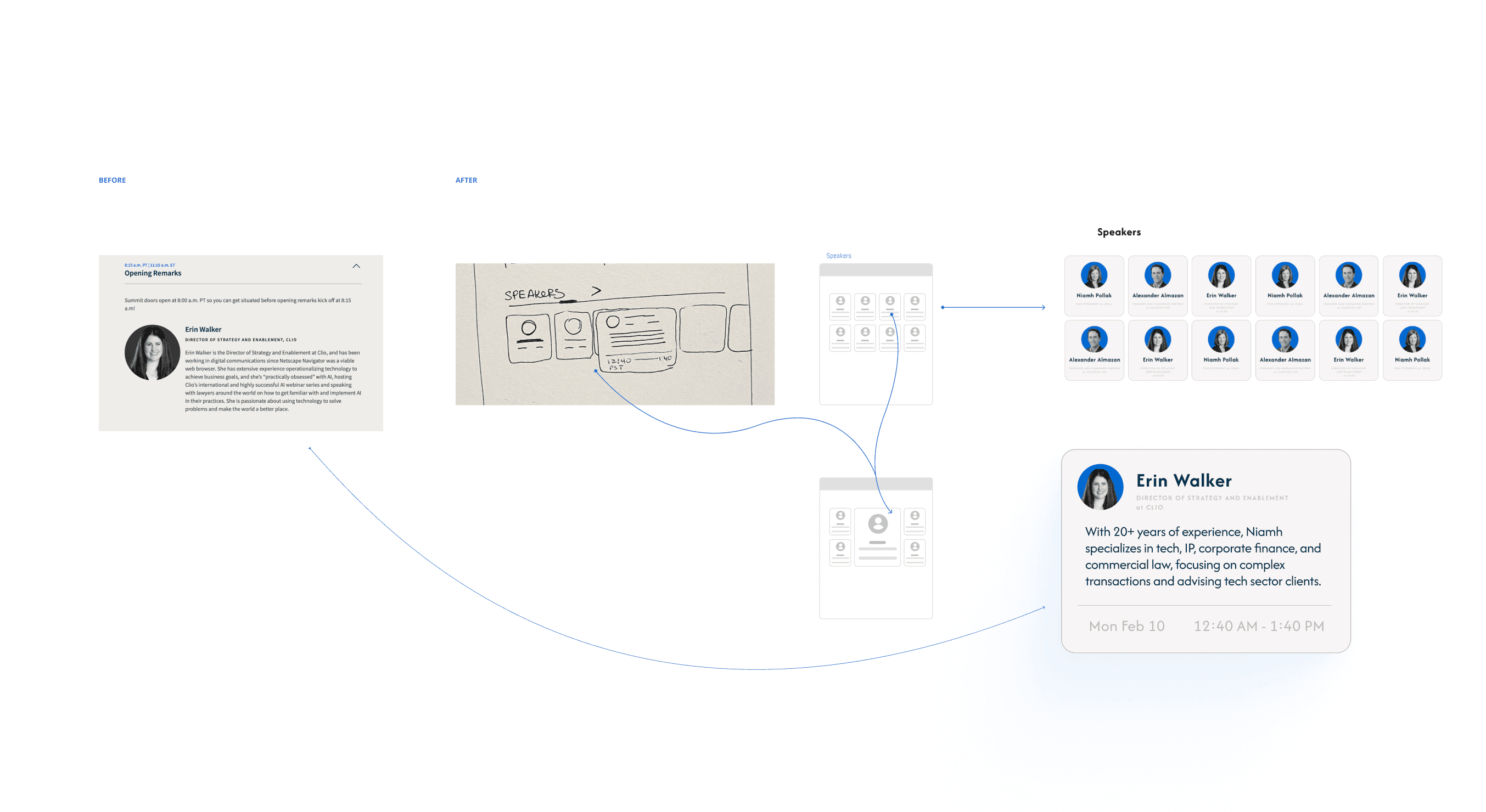
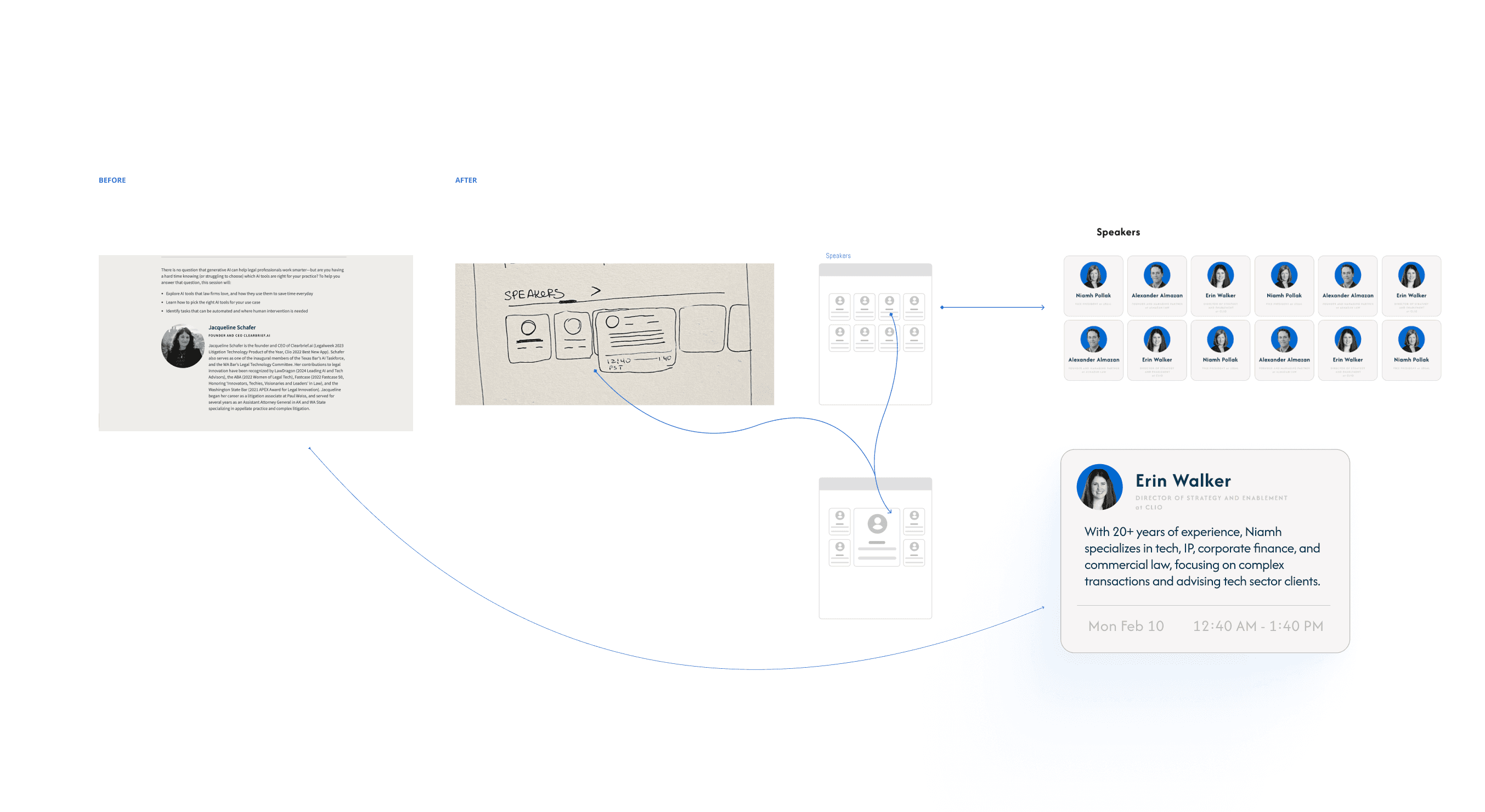
Event Information Visibility
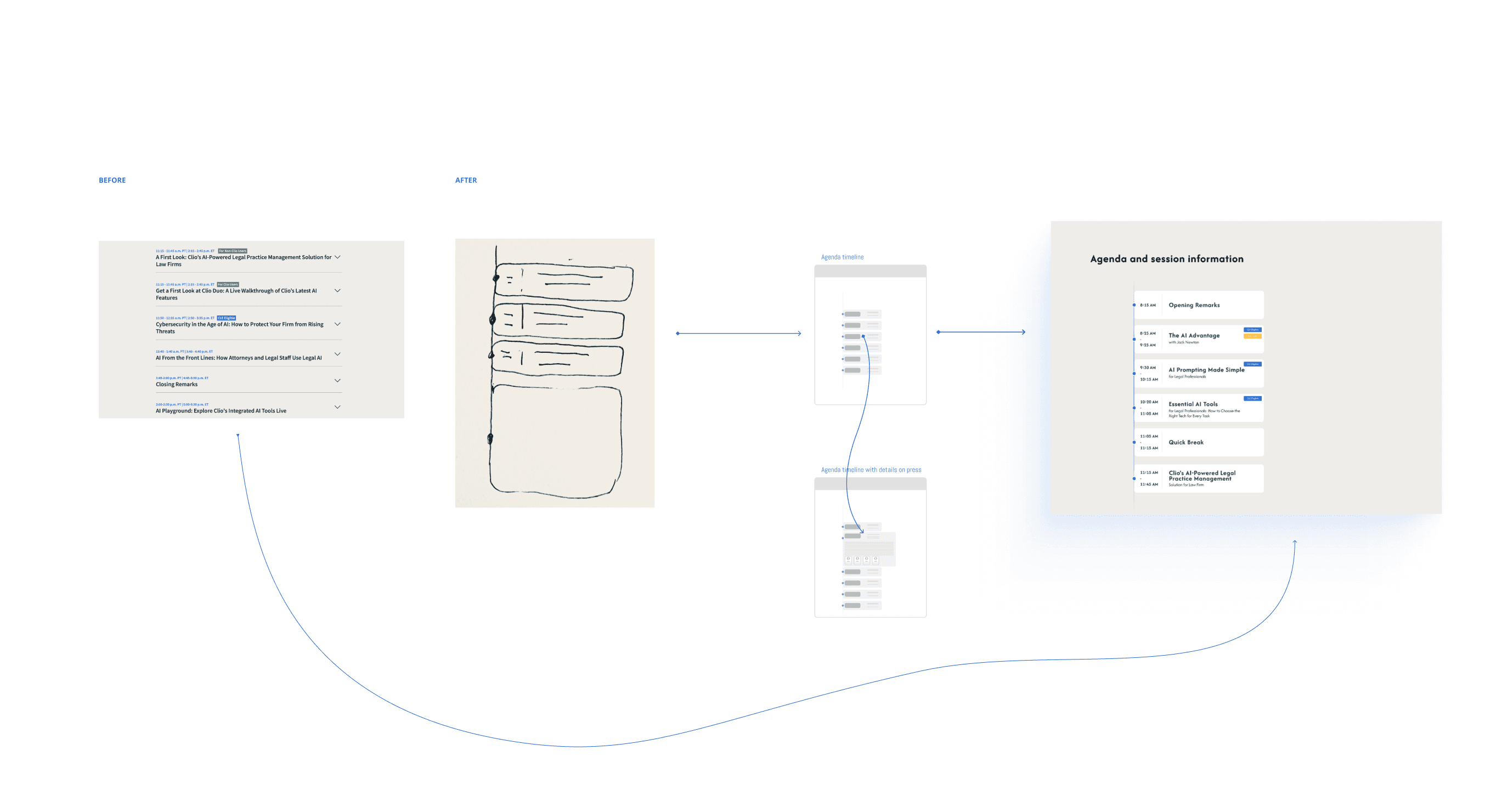
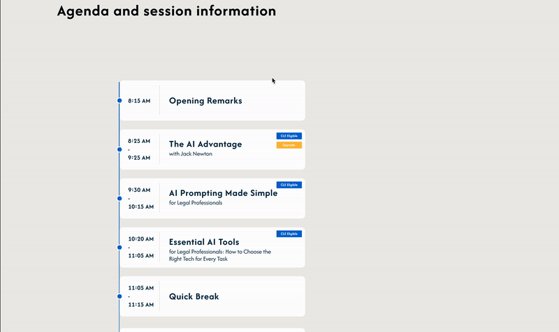
Event details like date, time, and speaker information were buried in text, requiring users to click multiple times to view the full event lineup. Solution: I designed a separate section dedicated to showcasing all the speakers and their sessions in one place. This removed the need for users to scroll through a timeline and enhanced accessibility to critical details with just a glance.
Overwhelming Text
A large amount of text made it difficult for users to quickly understand key information, causing them to leave the site.Solution: I simplified and structured the content, focusing on highlighting key points through strategic typography and visual hierarchy. This approach made the page more digestible and engaging, helping users focus on essential details.
Inconsistent Registration
The registration section did not align well with the overall brand style. Solution: I redesigned the registration block to fit the brand’s visual identity more cohesively. This ensured that the registration process felt integrated with the rest of the page, making it more intuitive and aligned with the event’s overall aesthetic.

Confusing Time Zones
Users were struggling to understand the event’s time due to time zone confusion. Solution: To solve this, I suggested adding a calendar widget that automatically adjusted the event time to the user’s local time zone using JavaScript. This change ensured that users could instantly see the correct event time without manually calculating time zone differences.

Unengaging Agenda
The original event agenda consisted of basic text with clickable elements, making it harder for users to grasp the event flow. Solution: I created an interactive timeline that clearly displayed the event schedule with hover animations and click interactions to reveal additional details. This approach made the agenda more dynamic and engaging, improving the overall user experience.
FINAL DELIVERABLES & RESULTS
A high-fidelity prototype with clean, intuitive user flows
This redesign helped streamline the user journey, improve engagement, and increase event registration. Through these improvements, users were able to find key information faster and more intuitively, making the event registration process more seamless and less time-consuming.
Interactive animations for key sections, like the agenda timeline and speaker list.