Role: Designer, and Packaging Strategist
PROBLEM
Create distinctive juice packaging that appeals to health-conscious, vegan consumers, avoiding clichéd farm imagery.
Product: Creative Concept for Juice Packaging
Team: Freelance
Duration: 3 weeks
The company wanted to introduce a healthy vegetable juice line but was concerned that traditional juice packaging (using photos of farm scenes or overly polished visuals) wouldn’t resonate with their target demographic of young vegans and health-conscious individuals. The goal was to differentiate the product in the marketplace with a design that felt authentic, natural, and visually aligned with the company’s core values.
SOLUTION
Authentic design, handmade elements, unique patterns, ingredient-focused, audience-driven.
Design solution
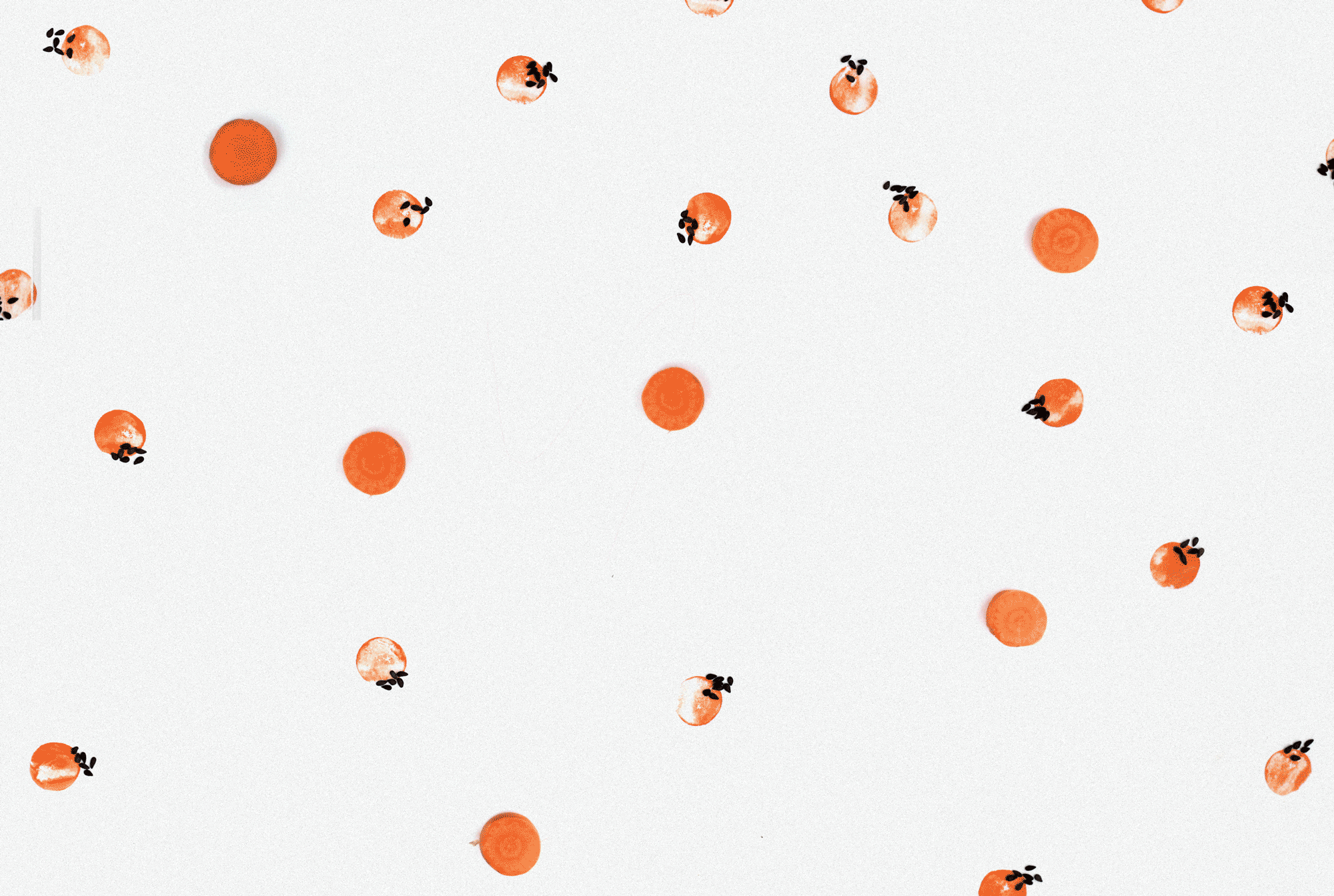
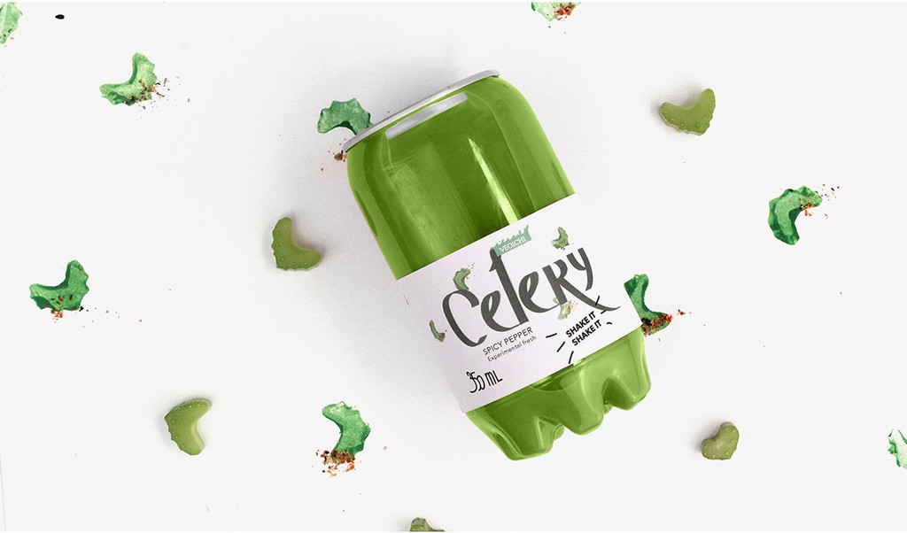
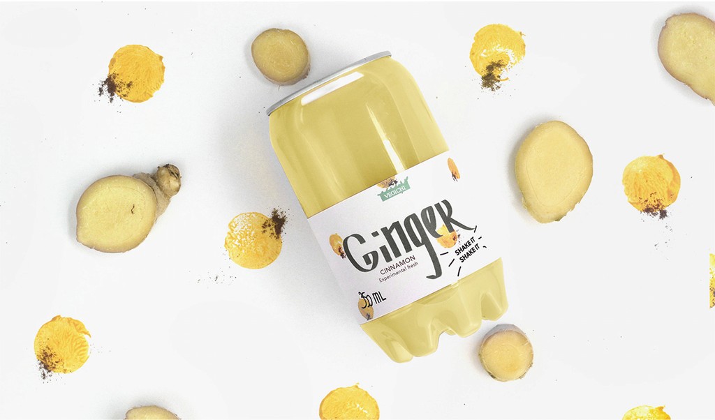
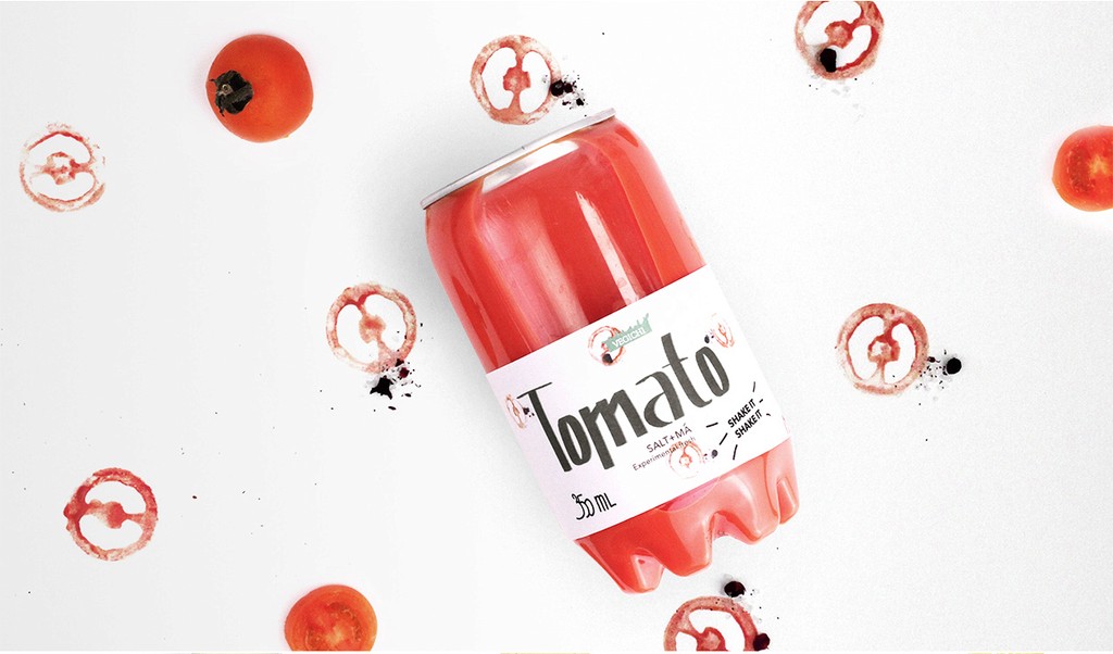
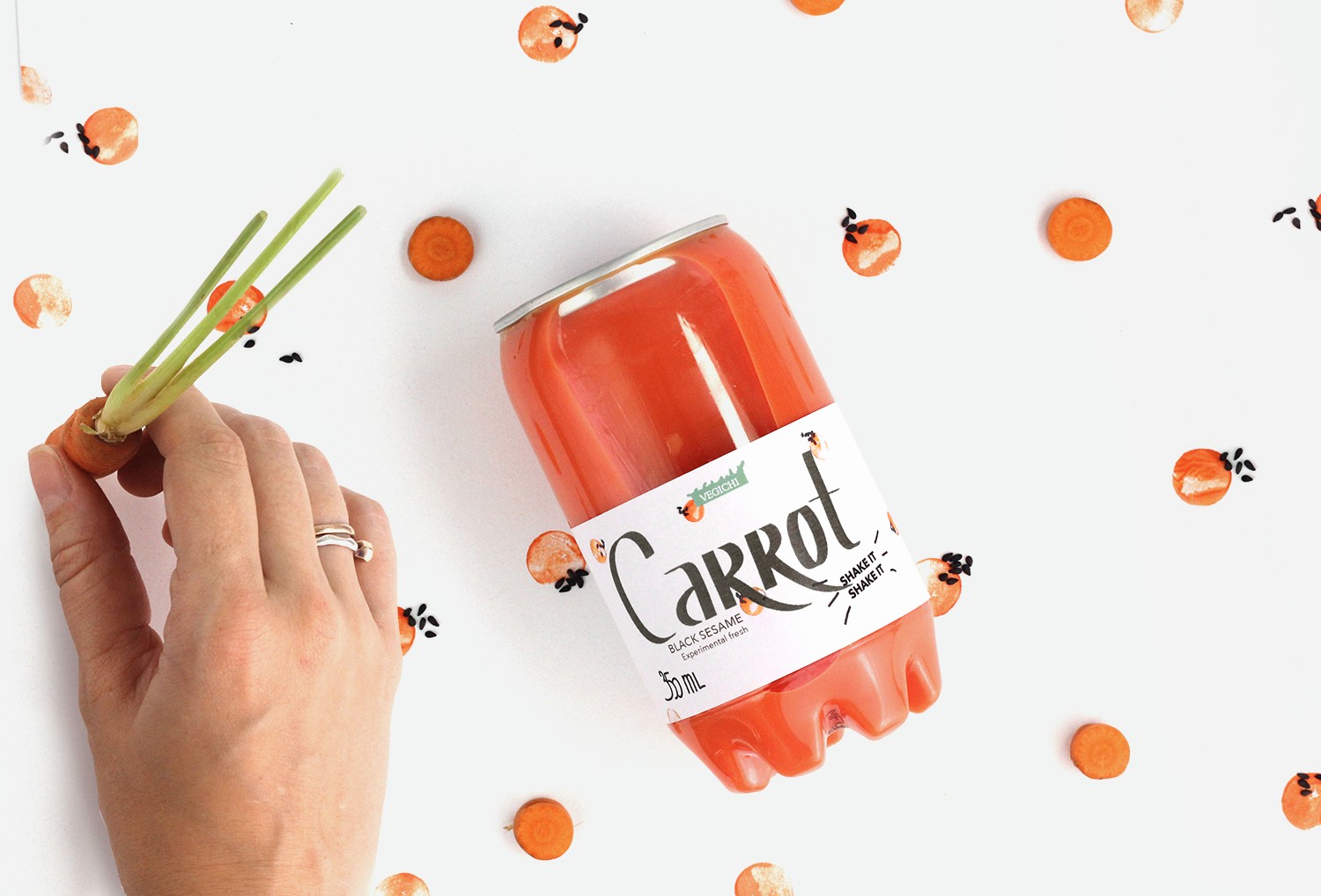
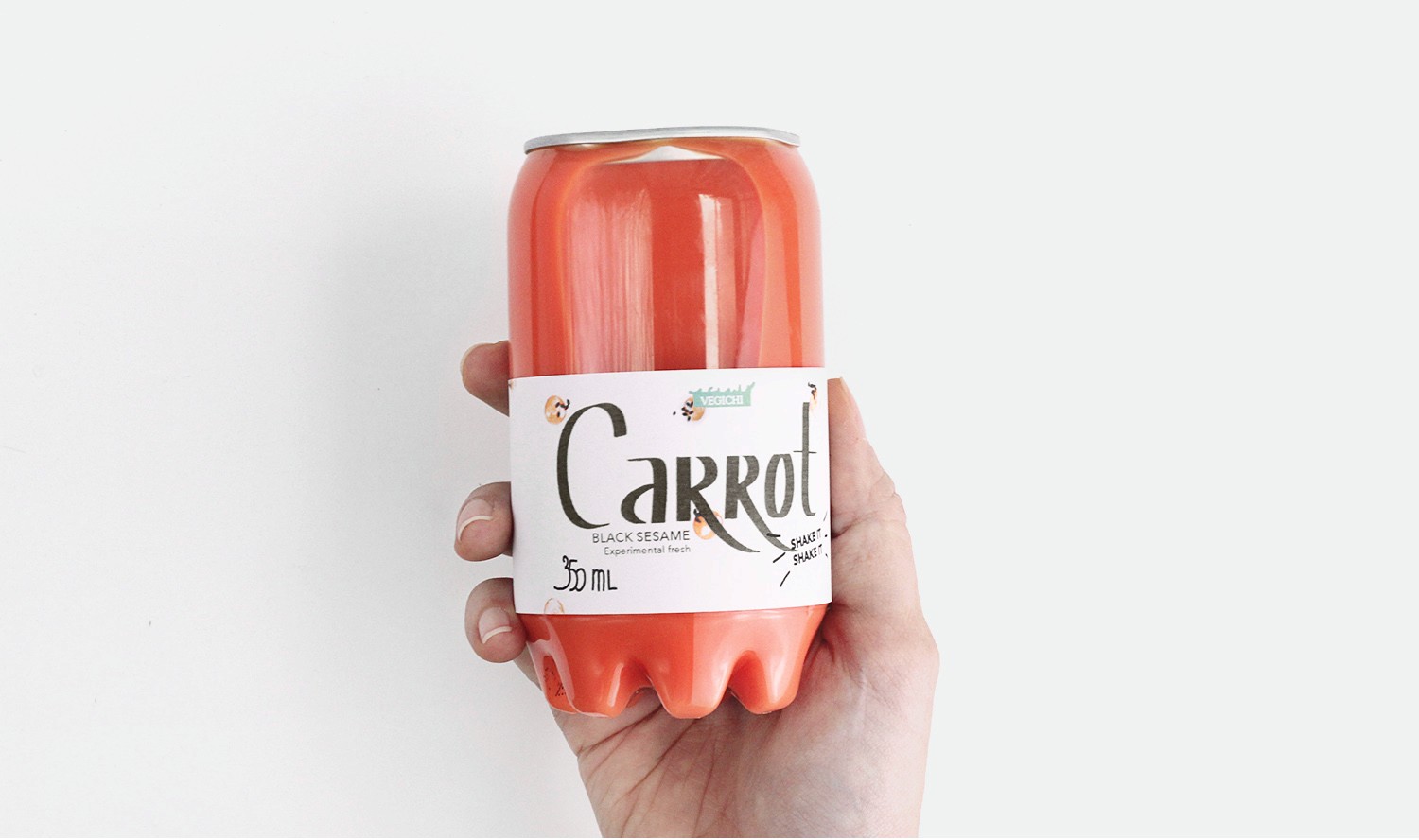
The final packaging features a unique, hand-crafted vegetable cut pattern, reinforced by hand-drawn lettering. The design feels fresh, simple, and authentic, with an earthy, organic vibe that directly connects the product to its natural ingredients.The typography used in the packaging is custom hand-lettered to reinforce the handmade, personal touch, avoiding corporate or overly slick fonts that might detract from the product’s authenticity.
RESEARCH
Target Audience
This project focused on creating a fresh and bold packaging design for a new vegetable juice product line aimed at health-conscious consumers. The design emphasized simplicity and authenticity, steering clear of unrealistic images or overused farm photography. Instead, handmade patterns inspired by the actual vegetable ingredients and hand-drawn typography were utilized to communicate the product’s natural, no-sugar-added appeal to a younger, vegan audience.
Audience Focus: Designed with a human-centered approach, targeting health-conscious individuals, particularly vegans and the younger "hipster" generation, who prioritize authenticity and sustainability. The packaging was crafted to resonate with their values, conveying the juice's healthy, unpretentious nature while fostering a personal, meaningful connection with the product.
DESIGN PROCESS
Crafting a Packaging Design that Reflects the Natural Essence of the Product

2
1
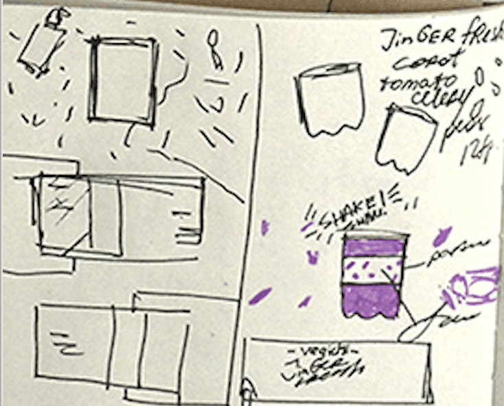
During the concept development phase, I worked independently to shape the creative direction, drawing from my passion for manual, hands-on design and a deep understanding of the product’s organic nature. The opportunity to incorporate hand drawing into the project truly made me happy, as it allowed me to bring a personal, tactile element to the design that aligned perfectly with the natural ethos of the product.
4
3
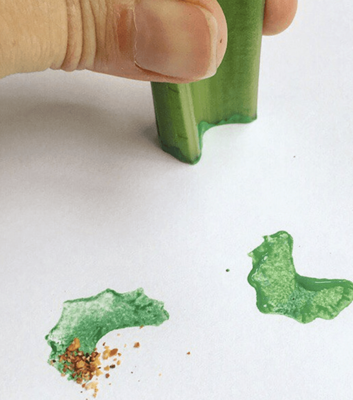
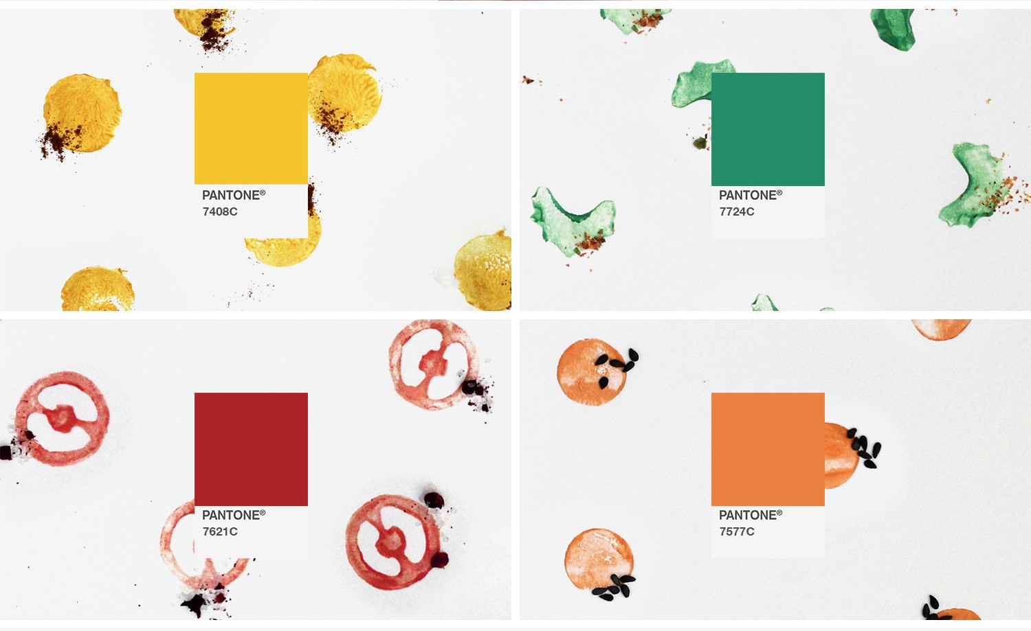
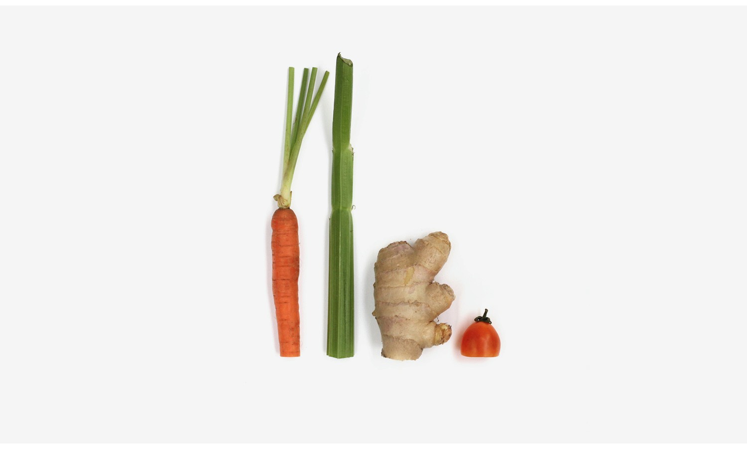
Focused on the actual vegetables used in the juices. Designed a pattern of vegetable cuts as stamps, emphasizing the handmade quality of the product.
Chose a minimalistic color palette to allow the vegetables and typography to stand out, reinforcing the product’s authenticity.
Color Palette:
The color palette was kept minimal, focusing on muted tones of green and earthy neutrals to highlight the natural qualities of the vegetables and communicate freshness and purity.
5
OUTCOME AND IMPACT
Impact and Recognition: A Design that Resonated
Results: The new packaging design was well-received by the target audience, helping to establish the juice line as an authentic and health-conscious product. By avoiding traditional juice packaging conventions, it stood out on shelves, and the handmade elements conveyed a sense of care and quality.
Client Feedback: Kristina was thrilled with the final design, as it fully captured the natural, authentic essence of the product while aligning with her vision for using manual processes in design. She felt the packaging was a true reflection of the values the company wanted to promote.
Increased Engagement: The unique and eye-catching design helped the product gain attention in a competitive market, attracting the vegan and health-conscious demographic. Social media buzz and shelf recognition increased as customers resonated with the authenticity of the design.
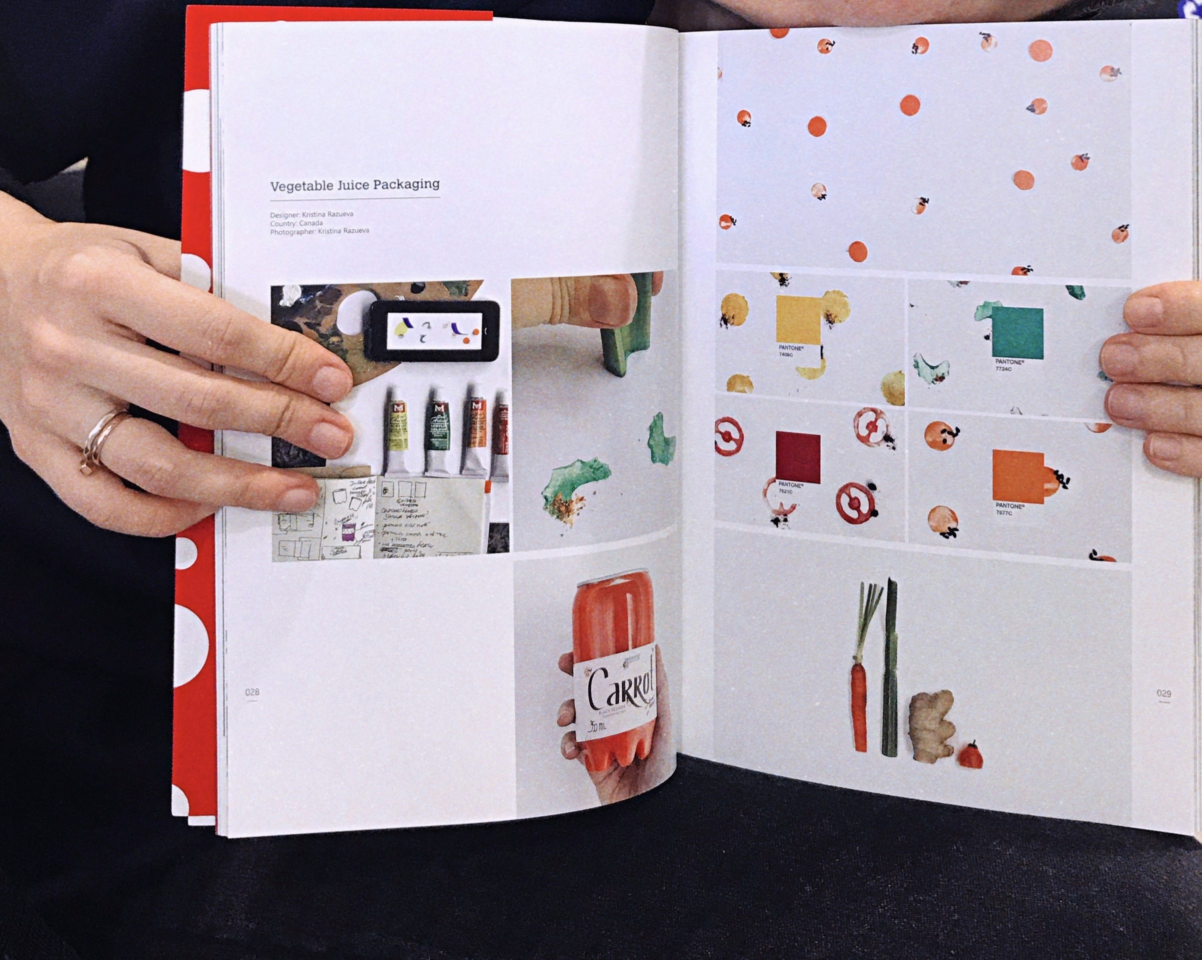
Developed unique, handmade typography to reflect the organic nature of the product, ensuring that the lettering matched the overall design ethos of simplicity and authenticity. The clean, modern font complemented the handmade vegetable cut stamps, creating a harmonious balance between nature and design.
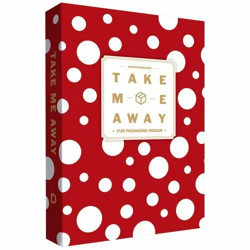
Recognition: After the packaging was released, it was featured in a renowned design book collection dedicated to packaging design, further cementing its place as a standout example of thoughtful, handcrafted product packaging.
Led brainstorming sessions with the client team remotely, from home, to explore how to best incorporate the raw, organic nature of the product into the design. Focused on simplicity and authenticity, while steering clear of clichéd farm imagery and overly polished visuals.